CSS Tricks: multicolumn
Splitting content into multiple columns is a common way to display text in books, newspapers and flyers. Guess what: CSS can do this for you!
1 2 3 | article { columns: 2; } |
That’s enough to create two columns, with automatic gutter width, columns widths and balancing. Not bad for one single line of CSS!
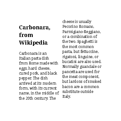
Of course, CSS gives you the possibility to configure a lot of things,
not only the number of columns. You want to add a small line between
your columns, increase or decrease the empty width between them, or
avoid automatic balancing? You can! Just play with column-fill,
column-rule and column-gap to get what you want.
Another main feature of CSS columns is spanning elements. If you
want to add a title that’s displayed across the whole block of columns,
just use the column-span property!
1 2 3 4 5 6 7 8 | article { columns: 3; column-gap: 3em; } h2 { column-span: all; } |
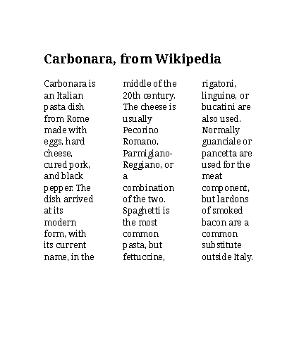
Columns are easy to use but can be hard to master. Finely controlling hyphenation, line height, orphans and widows can be useful to reach a rendering that’s both solid and beautiful.
Learn more about columns: